Cathleen Cusachs

User Experience and Web Design
Paper Bag Mask Foundation

This project was conducted as part of Boston University's MA in Emerging Media Studies program.
About
The Paper Bag Mask Foundation is driven to empower young adults who struggle with their mental health. Through their accessible classes and community outreach, they create opportunities for connection, confidence, and community. Their programming revolves around three pillars: exercise, creativity, and meditation.
Client's goals for the website:
-
Excite users about the organization and its services
-
Inform users about the mental health crisis and important resources
-
Build and present a community of participants, volunteers, and collaborators

Brand Colors
The final prototype homepage designed by the team.
User Analysis
The client's target audience:
-
Boston-based students or recent graduates
-
All genders, 14 to 25 years old
-
Familiar with technology, has quality standards for websites
-
-
Boston-based volunteers
-
Want to be helpful community members and establish meaningful connections
-
-
Potential collaborators, such as schools, universities, and private companies
-
Seeking authoritative, knowledgeable partners
-
Interviews were conducted with potential users on their experiences navigating an existing site.
These insights contributed to the following determined users' needs:
-
Concise presentation with an informational hierarchy
-
Clear content labels with actionable language
-
Visual presentation whenever possible
-
Information and resources easily accessible, without detracting from mission statement or intimidating new-to-mental-health users
-
Emphasized community aspect
Some Design Features
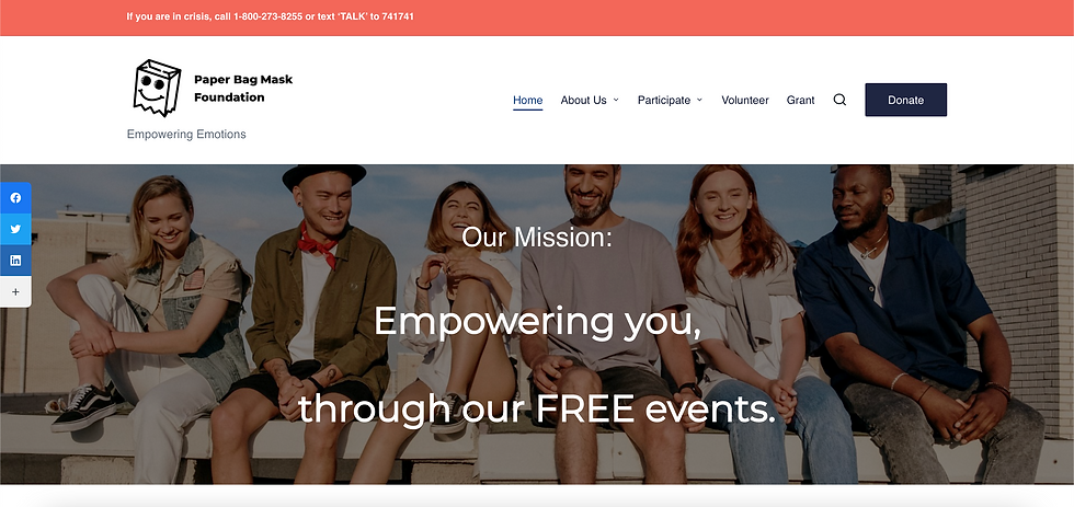
The homepage of the final prototype. The mission is stated immediately, and the image provides a heuristic cue about the org's community.
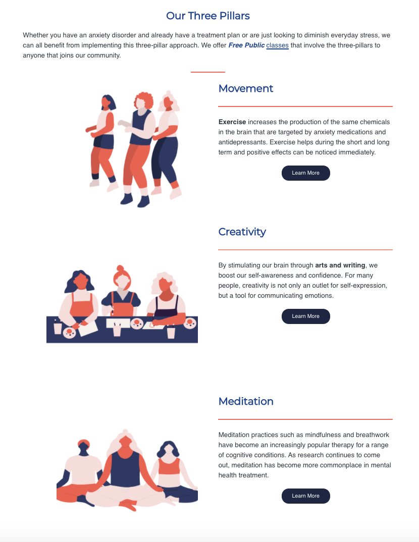
The three pillars were placed on the homepage for immediate user comprehension, and the accompanying images provide heuristic cues. Buttons were provided to point users on a clear path to further information, while keeping the homepage concise.

A custom loading page was also added to the site to increase brand awareness and keep users engaged.
The homepage of the final prototype. The mission is stated immediately, and the image provides a heuristic cue about the org's community.